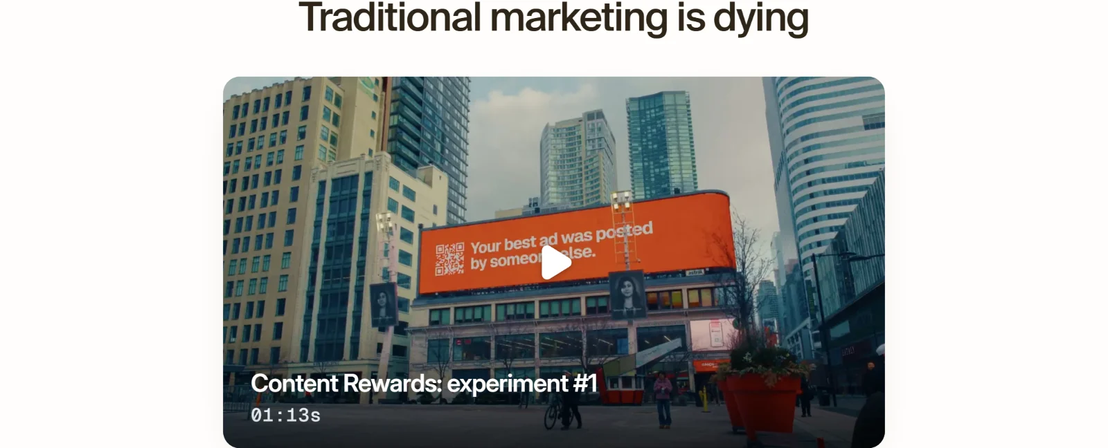
One marketplace, two front doors. Designing Content Rewards, end to end.
Warm, on purpose
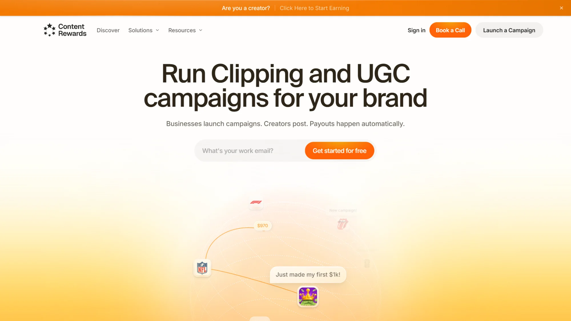
Content Rewards pays creators for the views their clips earn. A brand funds a campaign, creators post, and payouts follow the numbers. I designed the marketing site and the system it is built on.
Money and metrics read cold, so everything around them is warm: cream (#fffdfb) instead of white, a deep brown for type instead of black, and one orange that only ever means action. Suisse for headlines, Inter for everything else.
Here's the first thing you see. The globe is real 3D: it spins a little faster when your cursor moves, and it stops while you type your email, so nothing moves under your hands.
One door each
Brands land on the brand home. Creators get a single strip at the very top, in that same orange, with a site of their own behind it.

Here are the two heroes side by side. Same grid, same rhythm, the same button in the same place. Only the words and the picture change.


The product, not a picture of it
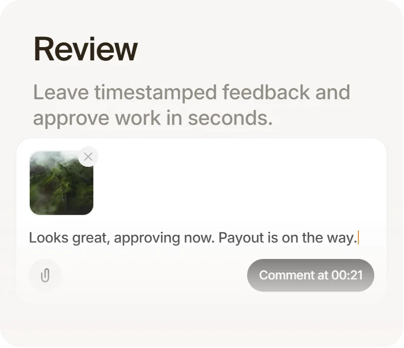
The marketplace section is a bento of four cards, and none of them is a screenshot. Each is built from the product's own parts, like this comment pinned at 00:21.
Here's the bot check. Hover anywhere on the card and the tooltip lifts 4px while a cursor slides into place, all in 300ms.
And here's Teams. The role chips fall with real physics and scatter away from your cursor.
Four models, one card
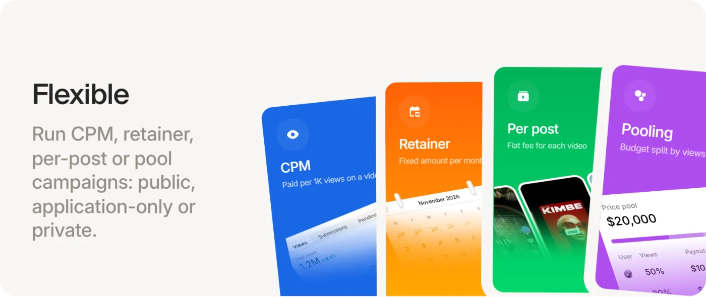
CPM, retainer, per post and pooling could easily have been four sections. Instead they are four tilted phones in one card, each in its own colour, so you see the difference before you read it.
The whole illustration is sized in units of the card's width, so it scales as one picture instead of reflowing.
Proof before price
A brand's first question is fraud, so verification comes straight after the pitch, drawn as a pipeline in four steps.
Here it is running. Dashes crawl along the connectors like data on a wire, the radar pulses every two seconds, and the counter keeps ticking up every few seconds instead of replaying. A loop that restarts reads as an animation; one that keeps counting reads as traffic.
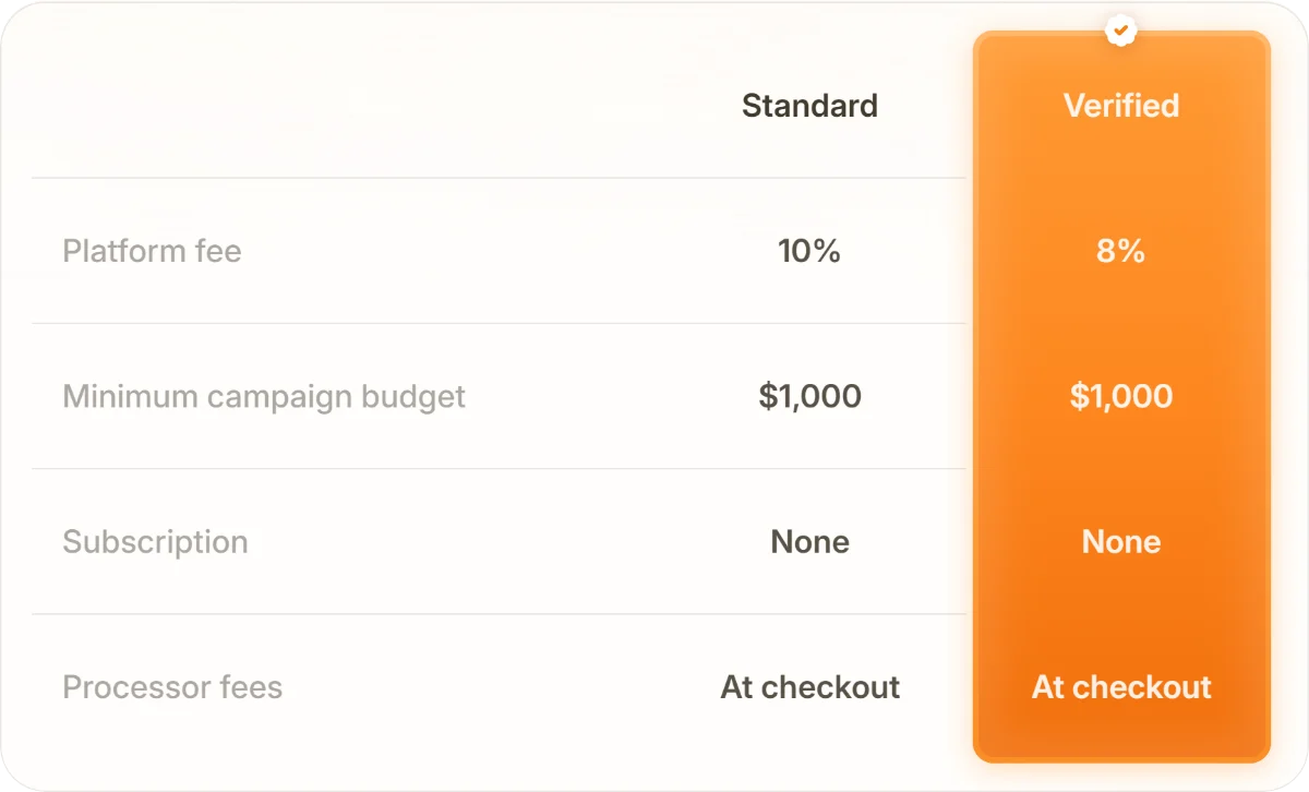
Pricing is one table, and the verified column is the only orange thing on it.
One curve, everywhere
Nearly everything moves on the same ease-out curve, cubic-bezier(0.22, 1, 0.36, 1). Headings rise 16px over 0.6s as they enter, and cards follow 0.1s apart.
Here's the logo row. It swaps one logo at a time every 1.5s, in a scattered order so it never reads as a ticker. The new logo arrives over 650ms, the old one leaves in 500ms, both through a 4px blur.
The page ends on a single card: a warm gradient, four facts, two buttons.

Not done yet
A few things are still on the list. The globe should respect reduced-motion settings, and a couple of sections still slip into a cold grey that doesn't belong to the system. Warm, on purpose, almost everywhere.
More from the work
Content Rewards, more from the work